#main_header-wrap {
position: relative;
margin-bottom: 10px;
display: flex;
flex-direction: column;
justify-content: flex-start;
align-items: stretch;
gap: 10px;
font: 400 9px var(--font);
text-transform: uppercase;
}
.main_header-item1 {
background: var(--header) center;
width: 100%;
height: 225px;
border-radius: 15px;
border: 1px solid var(--main-border);
padding: 25px 30px;
box-sizing: border-box;
display: flex;
flex-direction: column;
}
.header_newsline {
height: 17px;
width: 650px;
align-self: flex-end;
display: flex;
align-items: center;
position: relative;
overflow: hidden;
mask: linear-gradient(to left, #000 50%, rgba(0, 0, 0, 0) 100%);
-webkit-mask: linear-gradient(to left, #000 50%, rgba(0, 0, 0, 0) 100%);
-webkit-mask-repeat: no-repeat;
-webkit-mask-size: cover;
}
.newsline_content {
white-space: nowrap;
display: flex;
gap: 15px;
color: var(--text2)
}
.newsline_content {
animation: scroll-text 25s linear infinite; /* анимация будет двигаться 15 секунд */
animation-play-state: running; /* по умолчанию анимация работает */
}
.header_newsline:hover .newsline_content {
animation-play-state: paused; /* При наведении анимация приостанавливается */
}
@keyframes scroll-text {
0% {
transform: translateX(100%); /* Начинаем с правой стороны */
}
100% {
transform: translateX(-100%); /* Заканчиваем с левой стороны */
}
}
.newsline_content a {
background: var(--main-bg-second);
padding: 3px 10px;
border-radius: 15px;
font-weight: 650
}
.newsline_content strong {
font-weight: 500
}
.nav_wrap {
margin-top: 20px;
align-self: flex-end;
position: relative;
z-index: 11
}
.nav_wrap .slide_button {
border: none;
padding: 0;
font-size: 9px !important;
display: flex;
align-items: center;
gap: 10px;
}
.nav_wrap .slide_button:before {
content: "\f061";
font: 300 7px/100% FontAwesome !important;
background: var(--main-bg-third);
width: 16px;
height: 16px;
border-radius: 100%;
color: var(--text3);
display: flex;
align-items: center;
justify-content: center;
transition: all .4s linear 0s
}
.nav_wrap .slide_button.i_active:before {
transform: rotate(90deg)
}
.nav_wrap .link {
display: flex;
flex-direction: column;
gap: 5px;
text-align: center;
padding: 20px;
}
.nav_wrap .link a {
background: var(--accent);
color: var(--text3) !important;
font-size: 10px;
font-weight: 500;
padding: 4px 10px;
border-radius: 10px;
transition: all .4s linear 0s !important;
}
.nav_wrap .link a:hover {
background: var(--main-bg-third)
}
.header_logo-section {
margin-top: auto;
display: flex;
justify-content: space-between;
}
.logo-right {
display: flex;
flex-direction: column;
font-family: var(--font-a);
align-items: flex-end;
}
.logo-right span {
font-size: 10px;
font-weight: 300
}
.glitch {
font-size: 50px;
font-weight: 600;
text-transform: upercase;
position: relative;
display: inline-block;
margin-top: -5px
}
.glitch::before,
.glitch::after {
content: attr(data-text);
position: absolute;
top: 0;
left: 0;
width: 100%;
height: 100%;
}
.glitch::before {
left: 2px;
text-shadow: -2px 0 var(--accent);
clip: rect(24px, 550px, 90px, 0);
-webkit-animation: glitch-anim-2 3.5s infinite linear alternate-reverse;
animation: glitch-anim-2 3.5s infinite linear alternate-reverse;
}
.glitch::after {
left: -2px;
text-shadow: 2px -2px var(--accent-second);
clip: rect(85px, 550px, 140px, 0);
-webkit-animation: glitch-anim 3.5s infinite linear alternate-reverse;
animation: glitch-anim 3.5s infinite linear alternate-reverse;
}
.logo-left {
display: flex;
width: 140px;
flex-wrap: wrap;
align-items: flex-end;
justify-content: flex-end;
align-self: flex-end;
gap: 5px 2px
}
.header_music-section {
margin-top: auto;
margin-bottom: -20px
}
.audio-wrapper {
display: flex;
align-items: center;
justify-content: flex-start;
width: auto;
height: 15px;
position: relative;
z-index: 1;
gap: 10px;
color: var(--text2)
}
.player-controls {
width: auto;
height: 15px;
display: flex;
justify-content: flex-start;
align-items: align-items;
gap: 5px;
}
.song-panel {
display: flex;
height: 15px;
justify-content: flex-start;
align-items: center;
width: auto;
box-sizing: border-box;
}
.song-panel .song-info {
display: flex;
justify-content: flex-start;
align-items: center;
gaP: 5px;
width: auto;
text-align: left;
text-transform: uppercase;
font-size: 9px;
}
.song-panel .song-info .song-info__title {
font-weight: 600;
}
.song-panel .song-info .song-info__artist {
font-weight: 400;
}
.player-controls button {
height: 15px;
width: 15px;
cursor: pointer;
border: none;
margin: 0;
position: relative;
background: transparent;
display: flex;
align-items: center;
justify-content: center;
padding: 0;
}
.play {
display: flex;
align-items: center;
justify-content: center
}
.music-icon {
width: 15px;
height: 15px;
display: flex;
justify-content: center;
align-items: center
}
.music-icon:before {
content: "\f00c";
font: normal normal 9px FontAwesome;
color: var(--text1);
position: absolute;
}
.music-icon.icon-play:before {
content: "\f04b"
}
.music-icon.icon-backward:before {
content: "\f04a"
}
.music-icon.icon-forward:before {
content: "\f04e"
}
.play.playing .music-icon.icon-play:before {
content: "\f04c";
color: var(--text2)
}
.music-icon:hover:before, .play.playing .music-icon.icon-play:hover:before {
color: var(--accent)
}
.main_header-item2 {
display: flex;
gap: 10px;
height: 200px
}
.header_persons-container {
padding: 25px 30px;
border-radius: 15px;
display: flex;
flex-direction: column;
justify-content: space-between;
gap: 30px;
color: var(--text3);
width: 235px;
box-sizing: border-box
}
.besties-container {
background: var(--accent);
}
.persons {
display: flex;
flex-wrap: wrap;
gap: 10px 5px;
}
.persons-title {
font-family: var(--font-a);
font-size: 8px;
width: 100%;
}
.persons div {
width: 55px;
height: 40px;
border-radius: 5px;
overflow: hidden;
border: 1px solid var(--text3);
box-sizing: border-box;
position: relative
}
.persons div:before {
content: "";
display: block;
position: absolute;
background: var(--text3);
width: 100%;
height: 100%;
top: 0;
left: 0;
z-index: 1;
opacity: .15
}
.persons div:after {
content: "";
display: block;
position: absolute;
background: var(--accent);
width: 100%;
height: 100%;
top: 0;
left: 0;
z-index: 1;
mix-blend-mode: darken;
transition: all .4s linear 0s
}
.persons img {
width: 55px;
height: 40px;
object-fit: cover;
filter: grayscale(100%)
}
.persons div:hover:after {
opacity: 0
}
.persons.persons-alt div, .persons.persons-alt img {
width: 85px;
}
.need-container {
background: var(--main-bg-third);
}
.need-container .persons {
flex-direction: column;
gap: 5px;
}
.need-container .persons-title {
margin-bottom: 5px;
}
.persons.persons-weneed div, .persons.persons-weneed img {
width: 85px;
}
.persons.persons-weneed a {
display: flex;
align-items: center;
gap: 10px;
}
.persons.persons-weneed a:after {
content: attr(data-text);
flex: 1;
color: var(--text3);
font-weight: 400;
font-size: 8px;
line-height: 150%;
transition: all .3s linear 0s
}
.persons.persons-weneed div:before {
content: "";
display: block;
position: absolute;
background: var(--main-bg-third);
width: 100%;
height: 100%;
top: 0;
left: 0;
z-index: 1;
opacity: .6;
transition: all .4s linear 0s
}
.persons.persons-weneed a:hover div:before {
opacity: 0
}
.persons.persons-weneed div:after {
display: none
}
.persons.persons-weneed a:hover:after {
color: var(--accent)
}
.header_persons-container.best_post-container {
background: var(--main-bg);
flex: 1;
overflow: hidden;
gap: 15px;
}
.best_post-header {
margin: -25px -30px 0;
background: var(--main-bg-third);
border-radius: 15px;
padding: 25px 30px;
box-sizing: border-box;
height: 80px;
position: relative;
overflow: hidden;
gap: 15px;
}
.best_post-header .best_post-img {
position: absolute;
width: 387px;
height: 80px;
top: 0;
right: 0;
mask: linear-gradient(to left, #000 30%, rgba(0, 0, 0, 0) 100%);
-webkit-mask: linear-gradient(to left, #000 30%, rgba(0, 0, 0, 0) 100%);
-webkit-mask-repeat: no-repeat;
-webkit-mask-size: cover;
}
.best_post-header .best_post-img:after {
content: "";
display: block;
background: var(--main-bg-third);
width: 100%;
height: 100%;
position: absolute;
top: 0;
left: 0;
opacity: .6
}
.dark .best_post-img:before {
content: "";
display: block;
background: var(--accent);
width: 100%;
height: 100%;
position: absolute;
top: 0;
left: 0;
opacity: .6;
z-index: 1;
mix-blend-mode: darken
}
.best_post-header .best_post-img img {
width: 387px;
height: 80px;
object-fit: cover;
filter: grayscale(100%)
}
.best_post-content {
color: var(--text1);
text-transform: none;
font-size: 11px;
line-height: 140%;
flex: 1;
overflow-x: auto;
padding-right: 15px;
margin-bottom: -5px
}
.best_post-author {
text-align: right;
color: var(--text1);
}
.best_post-author-link {
font-weight: 600
}
.main_header-item3 {
padding: 5px 0;
display: flex;
flex-wrap: wrap;
gap: 10px;
justify-content: flex-end;
line-height: 100%
}
.main_header-item3 a {
background: var(--main-bg);
padding: 5px 10px 5px 5px;
border-radius: 10px;
font-weight: 600;
font-size: 10px;
display: flex;
align-items: center;
gap: 5px;
transition: background .3s linear 0s, color .3s linear 0s !important;
}
.main_header-item3 a em {
font-weight: 300;
font-size: 8px;
padding: 1px 4px;
background: var(--main-bg-second);
border-radius: 10px;
}
.main_header-item3 a:hover {
background: var(--main-bg-third)
}
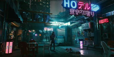

 28.07
28.07 прокрутка поколесиком мыши


